The courage to be different
A small manifesto — why standing out beats blending in, and why it takes nerve to reject the template and dare to make something singular.
I could build safe websites all day. Pick a known template, change the colours, swap the photos, ship it by lunch. Nobody would complain. The client would nod. And within a week nobody would remember it had ever existed. That's the comfortable path, and it's exactly the one I walked away from years ago, because a website that blends in has already failed at the only job that really matters: being noticed.
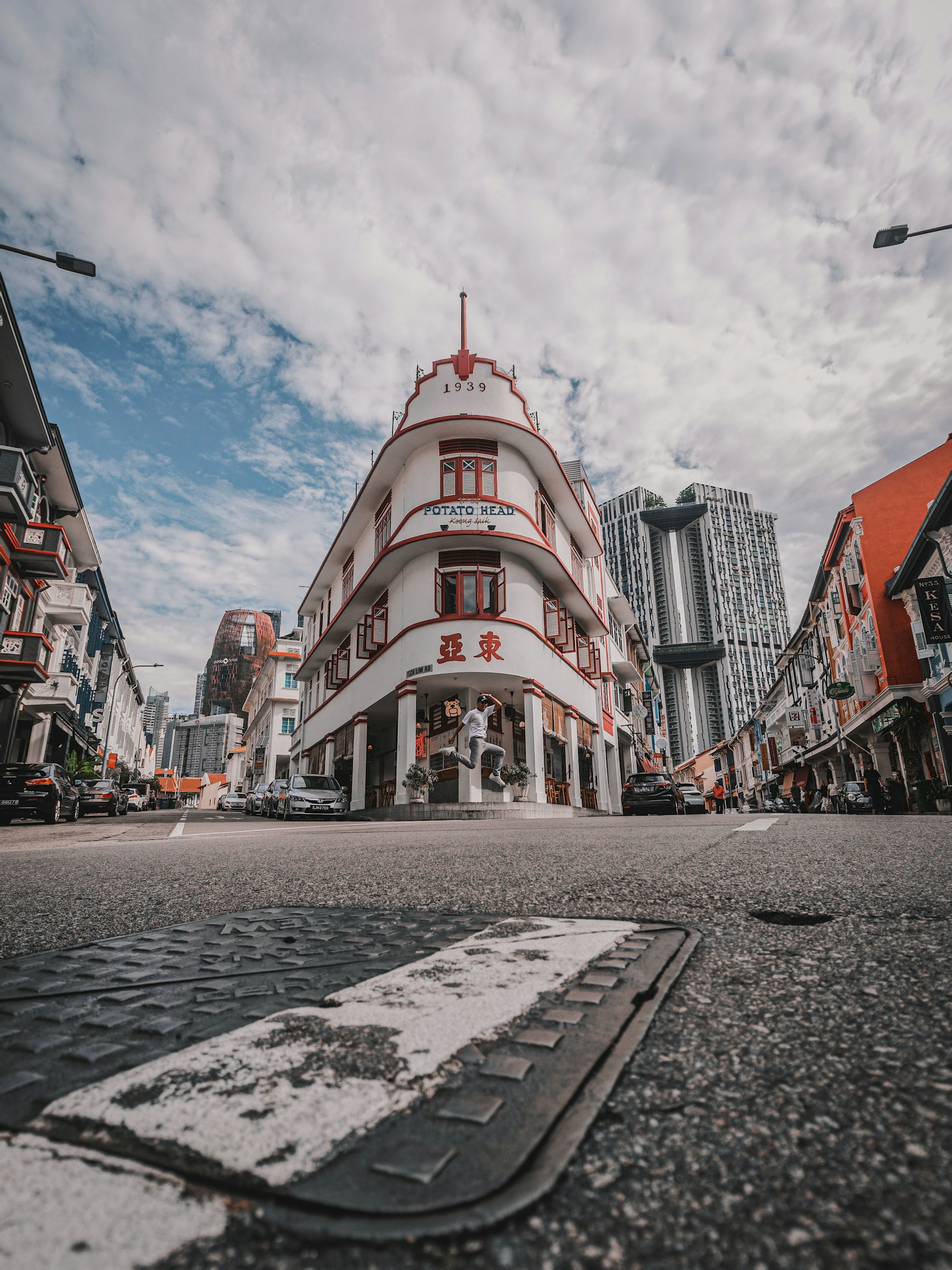
Look at the building on this page. A whole street of competent, sensible towers, and your eye goes straight to the one with a point of view. That's not an accident of architecture. That's what character does in a crowd. A website works the same way, except the crowd is the entire internet and the competition is one tab away.
The template is a temptation
Templates are seductive because they feel like safety. They're proven, they load, they're fast, and they let everyone in the room relax. But safety and memory tend to cancel each other out. If your site looks like a thousand others, then to the person visiting it, it is a thousand others, and being interchangeable is the quietest way to disappear on the web.
The internet in 2026 is wall-to-wall with clean, competent, utterly forgettable pages. They're not bad. They're worse than bad. They're invisible, and invisible loses to ugly every single time, because at least ugly leaves a mark on your memory.
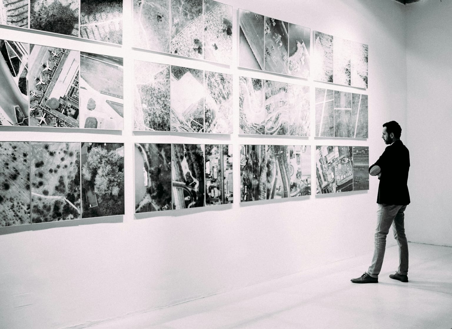
When everything is arranged in the same neat grid, the eye stops looking. It scans, it shrugs, it moves on. A template gives you that grid for free, and then quietly charges you the one thing you can't get back: the chance to be the thing someone tells a friend about.
Blending in is safe. Standing out is risky. But only the risk gets remembered.
Daring to be singular
Making something special always means making a decision you'll have to defend. A typeface nobody expected. A layout that knows every rule and breaks one on purpose. A single idea pushed far enough that it can't be mistaken for anyone else's. It's uncomfortable, because a real decision makes you vulnerable. And that vulnerability is precisely the sign of life in a site that has a point of view.
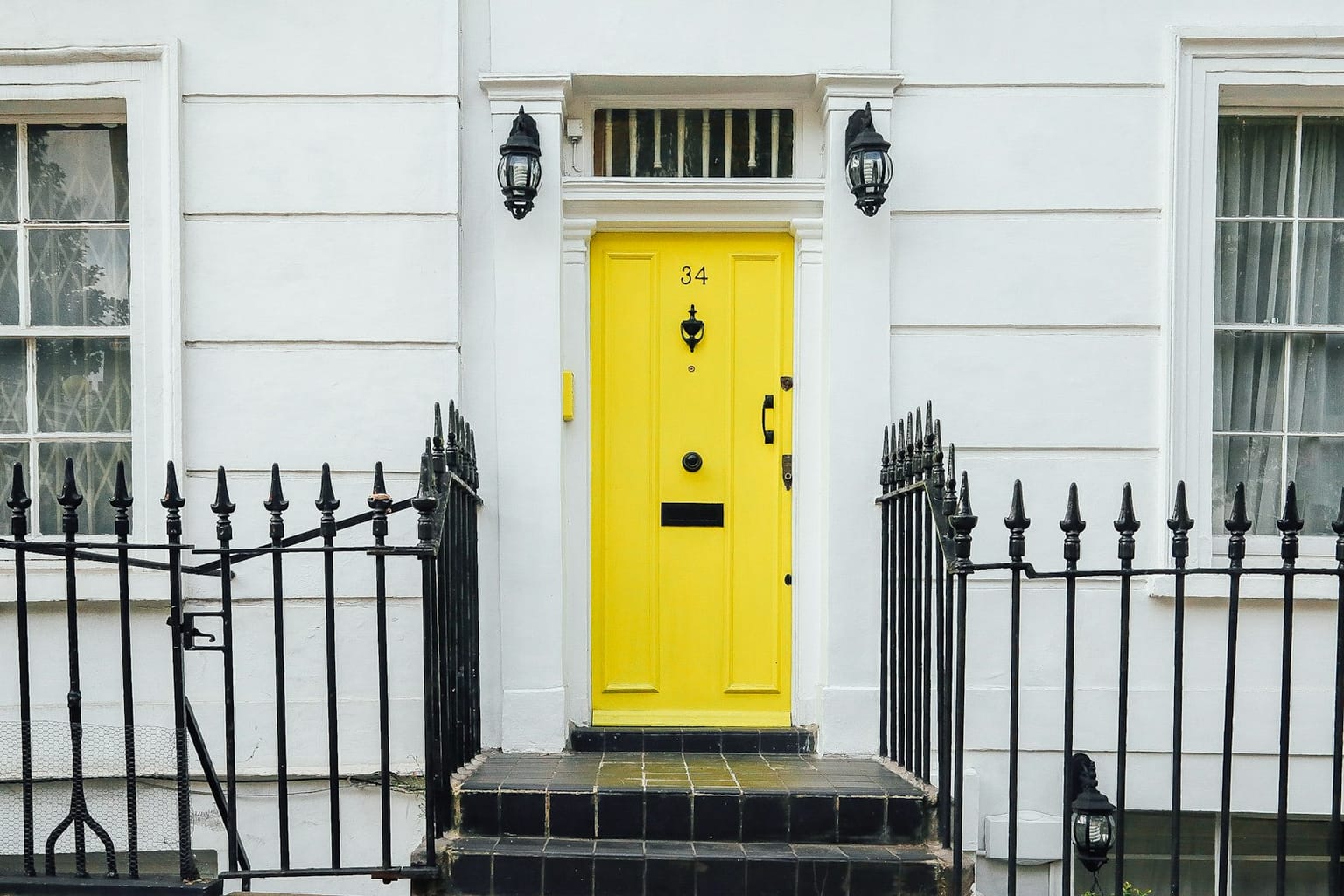
One yellow door. That's the whole idea. Everything around it is fine, and the door is the only part you'll describe to someone later. Standing out almost never takes more — it takes one brave, committed choice and the nerve to leave it loud.
On every project I ask the same question: what would this site do if it weren't afraid? Most of the time the honest answer is the exact thing that ends up making it unmistakable. Courage here isn't noise. It isn't effect piled on effect until the page screams. Courage is showing what's actually yours, even knowing not everyone will love it — precisely because it was never trying to please everyone.
Why people remember it
Here's what all of this is really for. Attention is the rarest thing on the web, and you don't earn it by being correct. You earn it by being someone.
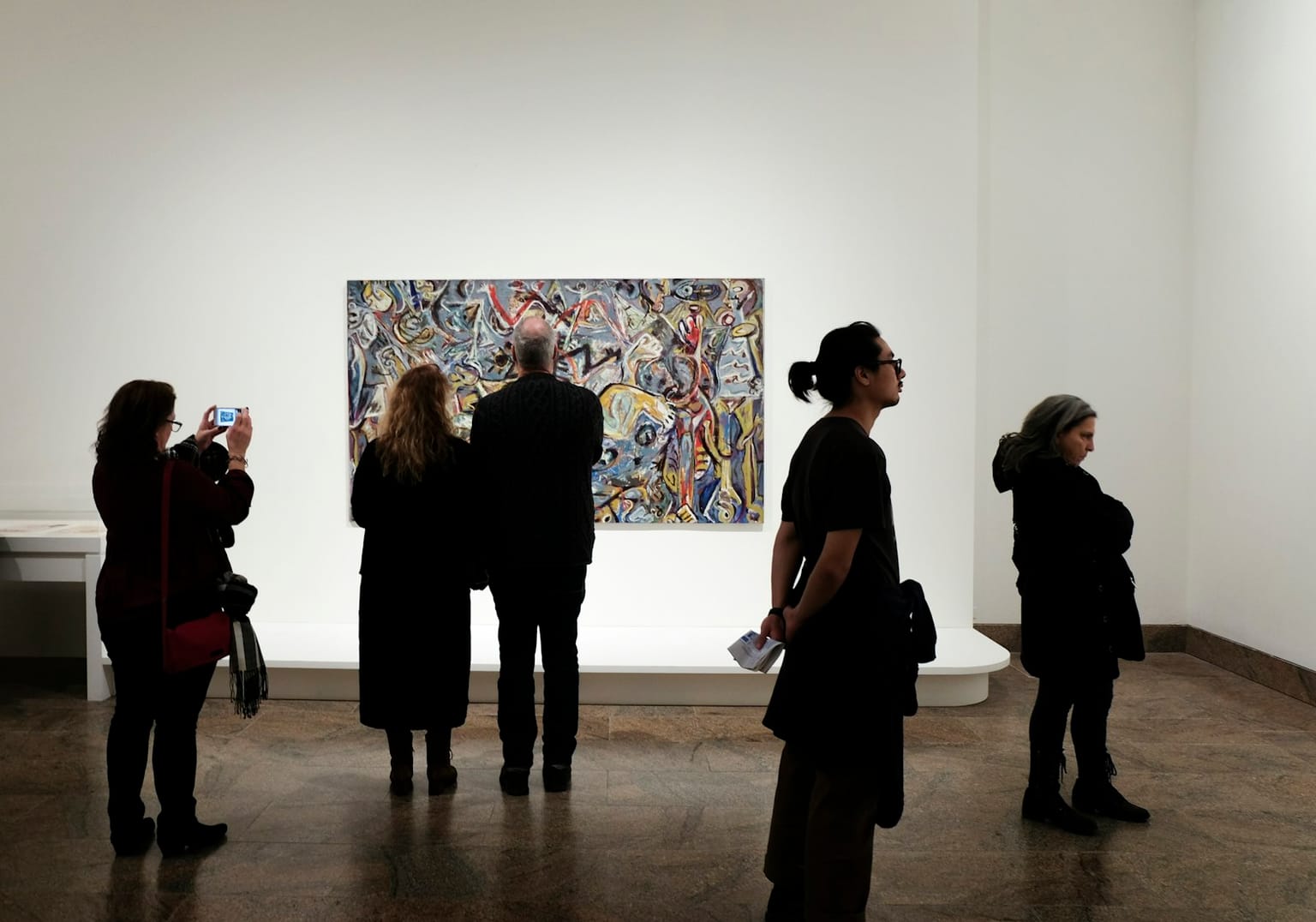
Walk through any gallery and watch where the bodies cluster. It's never the safe wall. People gather around the work that decided to be something, that took a position and held it. A website with that same nerve does the same thing — it slows people down, it earns a second look, it gets sent to a friend with the words "you have to see this."
A singular website is, in the end, an attitude and not a style. It says: someone here actually wanted something. The obvious option was on the table and got turned down; the right one got chased instead. That's the kind of work I chose to make, and honestly the only kind worth the trouble to me. Build something nobody can forget, and every risk you took to get there pays for itself.